Some Brand evaluation in 2008
Posted: Sat Apr 04, 2009 6:17 am
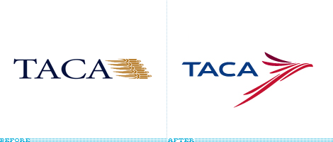
TACA / Probably the best new icon of the year, either as a representation of an eagle or a guacamaya. Heck, even if it represented a frog it would still be great.
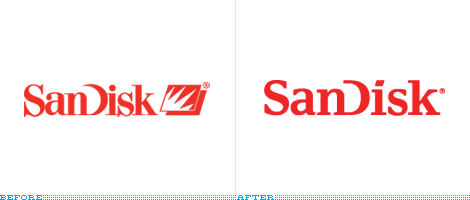
SanDisk / Pound for pound, letter for letter, ligature for ligature, the best redesign of a wordmark that retains the essence of the original while pushing the company into the new, young century.

rtve / Neither the most original, nor the most groundbreaking, but when you are dealing with a country's radio and television station anything that surpasses the stranglehold of committees at this scale and visibility gets a nod. And, it's actually a vibrant and cohesive identity.

Camel / Because it's a project that most designers would scoff at, and it's one of the best packaging redesigns in a while that actually advances the brand.
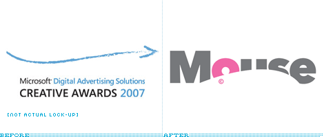
Mouse Awards / Sure, the old logo was barely a logo and pretty much impossible to screw up on the rebrand, yet this is an adorable and clever new logo. Plus, johnson banks had everyone in a tizzy with their April Fools.
Ford / Suckers! We had you going for our own April Fools. You were all good sports though.
Lifetime / A desperately needed change that managed to avoid something overly feminine or cloying and was able to introduce something with personality and emotion.
Pepsi / Top Dishonor / The response (best seen in this 400-plus-comments post) was absolutlely, defeaningly negative. I guess that speaks volumes to the lack of appropriateness for this change.
Anheuser-Busch InBev / A missed opportunity to create something that didn't look like it came from istockphoto.com. And, seriously, that type?
Capital One / A swoosh in 2008? And, even by swoosh standards, a crappy one at that? Really?
Animal Planet / This logo is neither animal nor planet. Discuss.
South Dakota State University Jacks / The result wasn't so offensive, but the process that led to it was simply embarrassing.
Xerox / Taking the marble-lowercase trend to the extreme. And sucking at it. Barclaycard came in close second in this category.
 ]
Econolodge / Yikes. Even for low-cost hotels this is one hell of a bargain. Key word: hell.
Some are good some are bad...
Thanks
 shomoy ashle amra DD er logo oo change korbo
